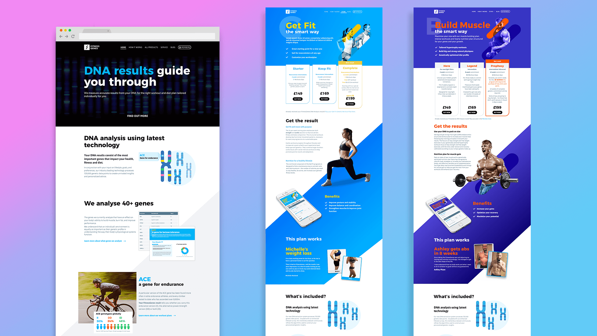
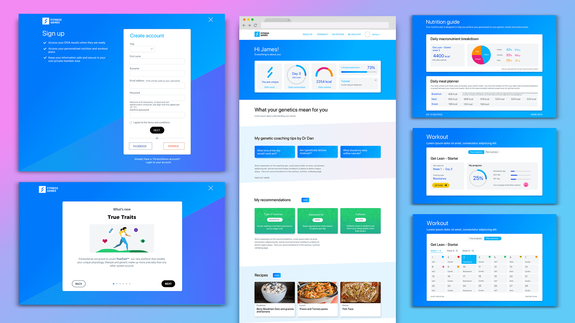
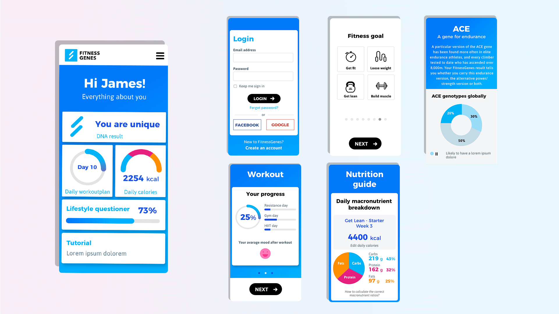
I had work at FitnessGenes (the world leader for interpreting DNA, genetic traits and environmental data for health and fitness) for over one year. In this role I worked on redesigning the product website and the members area projects involving running user research, creating user personas and performing continuous A/B testing to enhance user engagement and user experience. At this job I had close collaboration with developers, product managers, scientists and marketers.
Projects: Commercial website UI and UX design | B2B service pages UI and UX design | Members area / dashboard UI and UX design | Transactional email redesign | Marketing design
- UX & UI Web Mobile
- Members Ares Redesign
Case Study
OVERVIEW
Project Type: Website, mobile app
Tools used: Sketch, InVison, Adobe XD, Trello
Role: Lead Product Designer
The existing website had accessibility issues and limited features, causing low user engagement and high drop-off rates. The goal was to redesign the platform, making it more user-friendly, improving engagement, and introducing new interactive features.
CHALLENGES
- Outdated layout with accessibility issues.
- Difficulty presenting complex scientific content in an engaging way.
- High drop-off rates due to poor user experience.
PROCESS
- Research: Conducted user interviews and surveys, analyzed competitor platforms, and created three user personas.
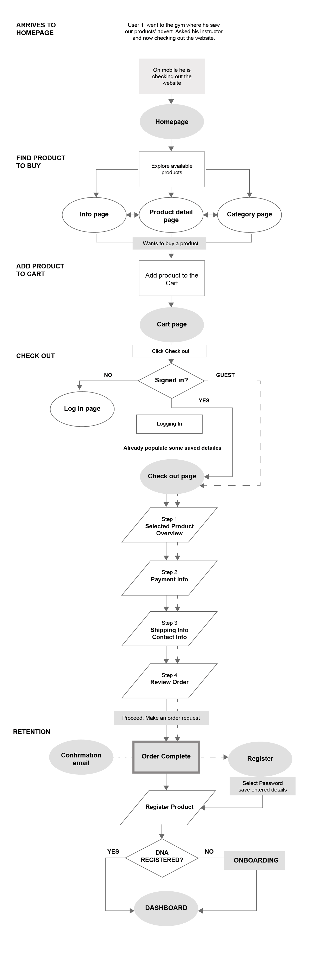
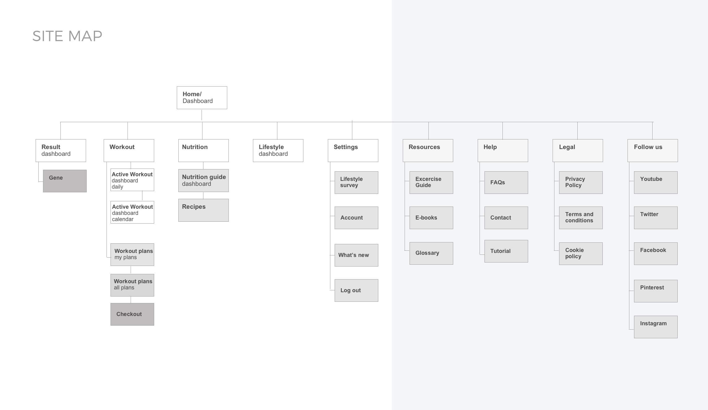
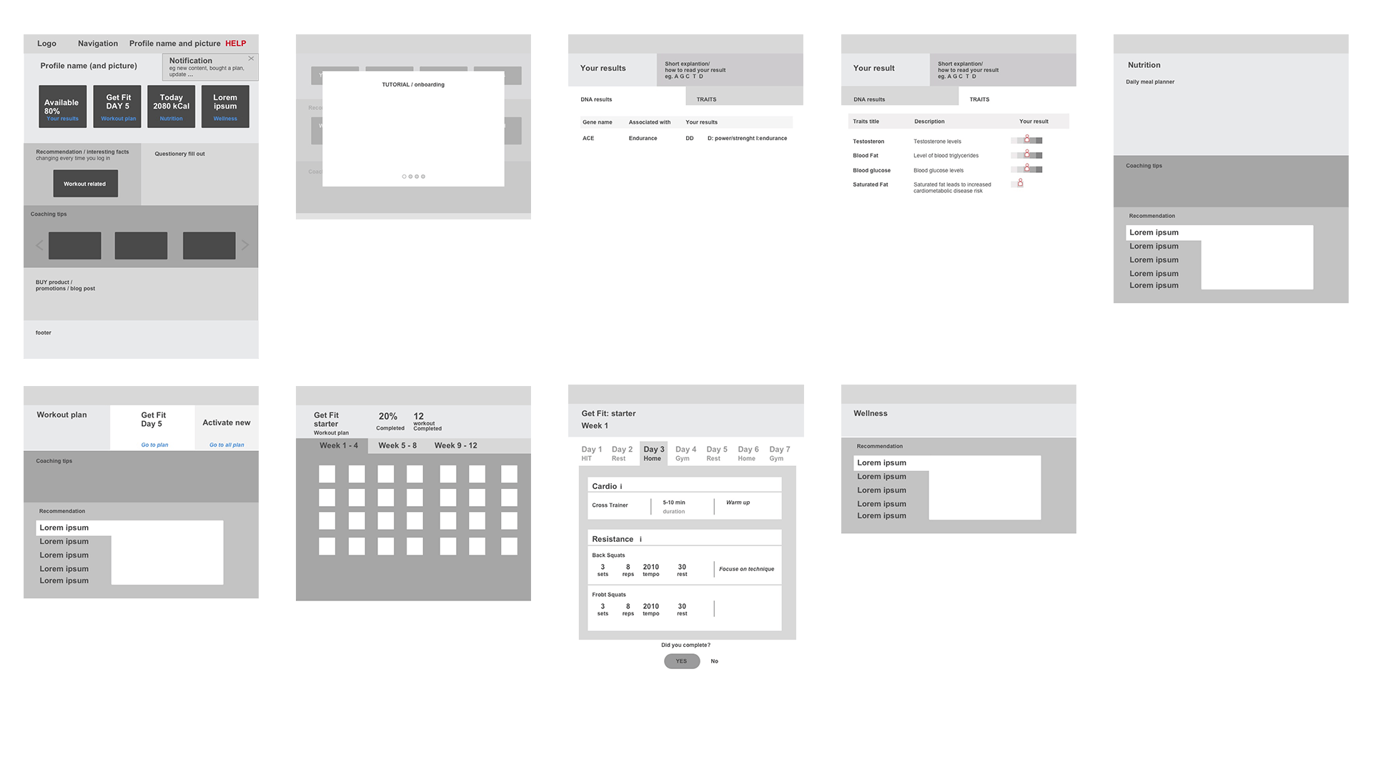
- Ideation: Developed wireframes and user flows, focusing on a cleaner interface, simplified navigation, and better content organization.
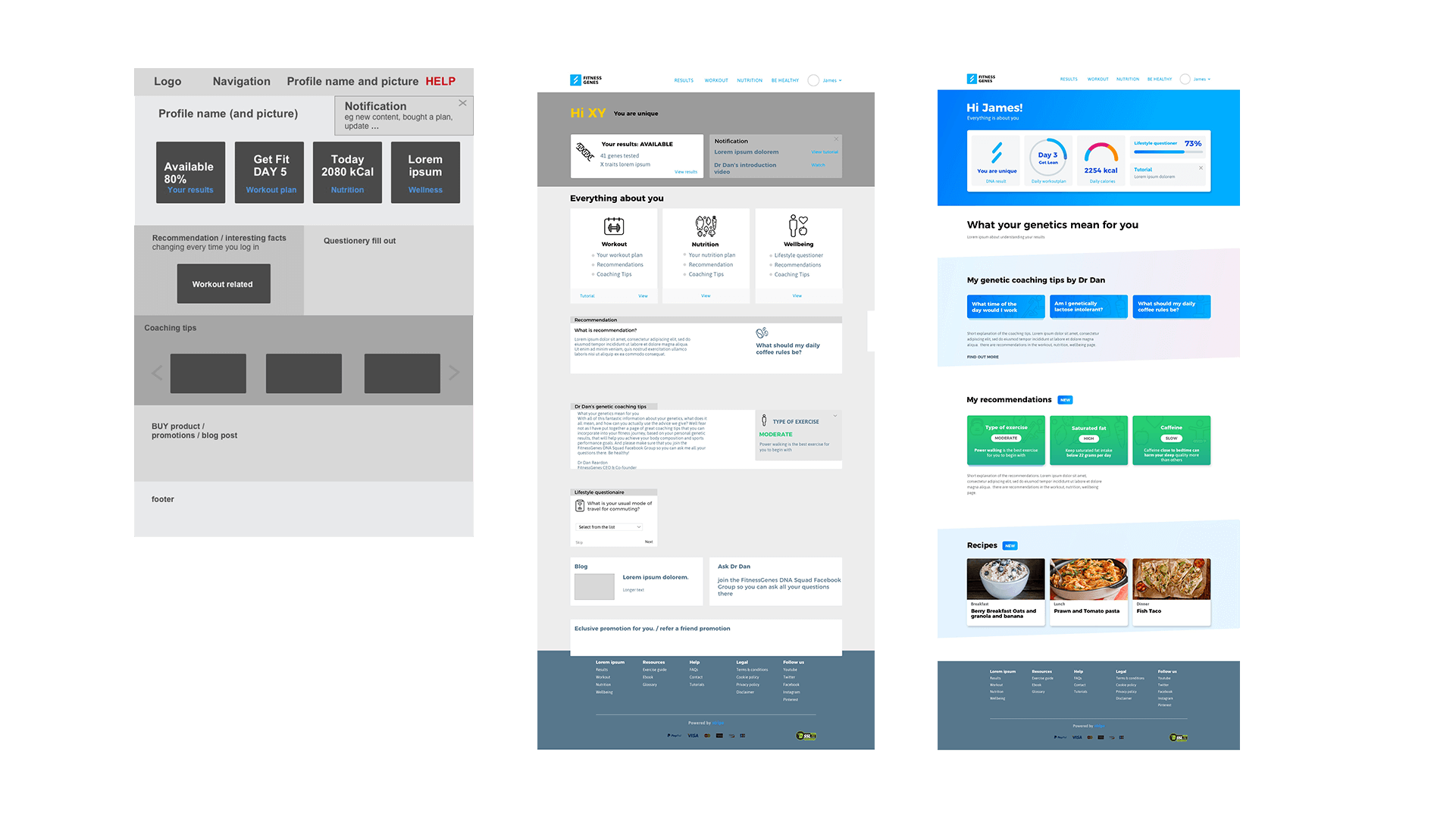
- Design: Created interactive prototypes in InVision, using visual aids and accessible design elements to improve the user journey.
- Testing: Ran usability tests, refined the design based on feedback, and optimized the navigation structure.
RESULT
- +25% increase in user engagement.
- 30% reduction in drop-off rate.
- Enhanced accessibility and user satisfaction, making complex scientific content easier to explore.


